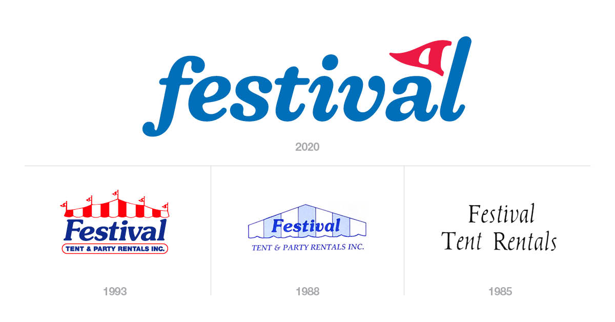
People often freshen up their look by getting bangs, a spray tan, or a new pair of shoes when they need a change. When you are a business, however, you refresh your brand identity, and part of this makeover involves your logo. But, unlike the spur of the moment haircut, we did not make this decision over night. It took a lot of time, thought, and consideration.
But we knew it was time because:
1 – We remember using a Commodore 64 (and so do many of our customers)
You could say that being in business for 35 years makes us a millennial, and just like any thirty-something-year-old, we feel like 1986 was only ten years ago. Shockingly, it wasn’t. It also gave us an opportunity to remind our team and Windsor-Essex that our commitment to be the best wherever we go is stronger than ever.
2 – Our last refresh was a millennium ago
Our previous logo was one of four, and while it fulfilled our needs for some time, it doesn’t quite meet our requirements today. So, our Festival team, along with SKO Communications, worked to create a simple, more modern logo.
Not unlike the cooler, more mature guy at the party (you know how we feel about parties) who looks good in a simple white tee, as businesses mature they need less fuss to make a statement or to be recognized.

However, updating doesn’t mean we tossed everything old out with the trash. We decided to hold on to a few elements of our old logo (after all, the 90s are coming back). Together, the old and new better represents the joy we experience in supplying you with the best in event rentals.
Plus, we look cooler doing it.
Updates to other visuals and messaging also helps us remain recognizable and stand clear on our commitment to be your champion. For instance, we took the work from refreshing the brand and, voila, created a website that better suits not only who we are as a company, but who you are as a customer.
A win-win, wouldn’t you say?


